A variety of examples of pyam’s plotting capabilities.
pyam
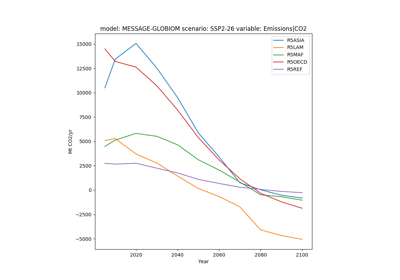
Plot Timeseries Data
Plot Regional Data
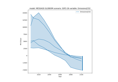
Plot Ranges of Data
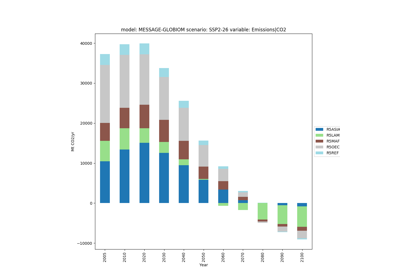
Plot Data as a Stack Plot
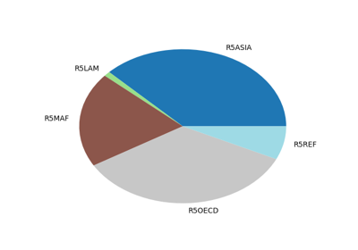
Plot Data as a Pie Chart
Plot Data as a Bar Plot
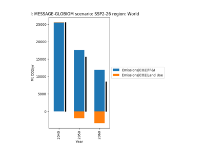
Plot Data as a Bar Plot with Net Value Lines
Gallery generated by Sphinx-Gallery